Nieman Foundation at Harvard
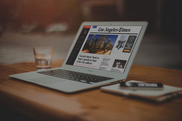
The Los Angeles Times is about to redesign its website; it’ll go live overnight. Some screenshots are at Politico. The Times worked with Code and Theory, which has done some fine work with other news brands — The Verge, Ebony, Interview, the original Daily Beast, and more. (You can tell it’s a website redesign because it features the legally required shot of a MacBook Air, an iPhone, a Moleskine, and a beverage, all on a smooth wooden tabletop.)
It looks nice! It’s got some Code and Theory trademarks — slab serif headers, contrasty serif headlines, white text on black — and recovers the persistent left sidebar from its demise on The New York Times’ front page in January. (I thought app-influenced web design might have peaked, but this look echoes the pane-heavy look from many iPad apps.)
When I look at a new news site redesign, the first place I turn is the new article page — the template that, despite making up the lion’s share of traffic, often gets the least love. I didn’t see the L.A. Times article page posted anywhere, so here it is (click for a larger look):

The most noteworthy thing here is the multiple calls to share. Not only are the pullquotes tagged with a “SHARE THIS QUOTE” — the entire story has three “sharelines” that amount to pre-written tweets. (I assume the disclosure triangles next to the bird allow sharing on Facebook or elsewhere.)
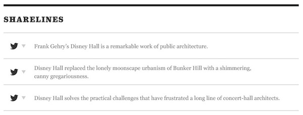
That they’re placed at the top of the article (a) takes advantage of the fact many people share before reading (remember, social media is performative) and (b) lets them serve as bullet-pointed story highlights to draw the reader in. (I can only imagine the reaction in the Times newsroom when the memo goes out that reporters will be asked to write three pretweets with each article.) I added a similar write-a-tweet-for-your-user option into Tweetable Text.
I’ll be curious to see how often those pretweets are used. (Some academic should track that! Should be easy to measure the share of tweets to a given latimes.com url that use the language provided.)
This move reminds me of one in the recent redesign of the literary magazine n+1. Its articles often have headlines that don’t, on their own, do a very good job for telling you what they’re about. (It’s a literary magazine, after all, not an SEO factory.) That’s fine in a print magazine, but doesn’t work as well online. So n+1’s new archive pages feature tweet-length excerpts from each story.
In the archives of @nplusonemag, all my articles for them come pre-tweeted: http://t.co/WzrLNMFJ3U
— Caleb Crain (@caleb_crain) April 21, 2014
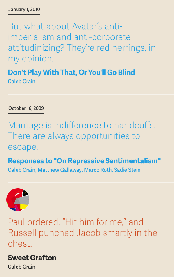
Those pullouts (“Marriage is indifference…”) don’t even get highlighted on article pages. They’re metadata created just for the other contexts on the site in which the story might be referenced.
It’s not quite the same — n+1’s move is more about elucidation, not social marketing. But they’re both reminders that the web increasingly demands multiple points of entry to any one piece of content — and that our CMSes and metadata would benefit from keeping up.
One last point: Digiday’s writeup of the site notes something interesting about article pages you can tell from screenshots (emphasis mine):
With people increasingly coming straight to articles through social sharing, the Times realized it needed to make article pages the new home page. So at the end of articles, readers will be given recommendations for content elsewhere on the site. That’s pretty standard, but readers also can view that content by just continuing to scroll without going to a new page, doing away with endless clicking.
I believe it was Quartz that was the first mainstream news site to pull this trick — scroll to the bottom of one story and bam, you’re in another one — which again is a derivative of native app UX. The recent Time redesign does the same. It might be the best solution we have today for the second-click problem: If more of your audience is coming from social, how can you get readers to stick around and read more, rather than just heading back to Twitter or Facebook?


